Yahoo – Un aperçu de sa future page d’accueil
Je vous partage un article déniché sur le NYTimes.com. Je commence à devenir accro de ce site, une vraie merveille.
Quoiqu’il en soit, cet article révèle la maquette de la future page d’accueil de Yahoo. Il n’est pas surprenant d’apprendre que Yahoo suivra la tendance du marché, soit d’intégrer les Facebook / MySpace / Gmail / eBay et autres applications web très utilisées. Plusieurs autres sites le font déjà, mais ok .. ok .. très peu de portails. Faut leur donner le mérite.
Toutefois, ça m’agace un peu cette nouvelle. Quoique je comprenne l’intention, soit de créer un “one-stop-shop” de nouvelles / divertissement / communication visant augmentera le temps passé sur le portail, le nombre de pages vues (impressions publicitaires) l’engagement, etc, j’ai l’impression qu’on capitalise sur des produits non-exclusifs qui pourront facilement se répliquer ailleurs (soit chez les compétiteurs).
Mais bon, je dois réfléchir à tout ça, entretemps bonne lecture !
Yahoo Plans to Unveil a Revamped Home Page
By Miguel Helft
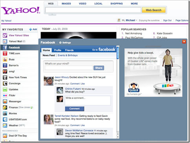
Yahoo A screenshot of the new Yahoo home page, with a preview of a Facebook application.
After many rounds of testing and nearly a year of painstaking development, Yahoo is poised to introduce a thoroughly overhauled home page on Tuesday, a major step in the struggling company’s efforts to remake itself for users, advertisers and investors.
The outlines of Yahoo’s approach to redesigning the most popular home page on the Internet have long been known. The company has said time and again that it wanted to provide something of a dashboard that offered its users a view not only into their favorite Yahoo content and services, but also into third-party applications and sites they use frequently, like Facebook, eBay or Gmail. The idea was also to make it easy for users to customize that experience.
Jerry Yang, Yahoo’s co-founder and former chief executive, had described the goal as making Yahoo into a “starting point” for users on the Web. In the Carol Bartz regime, the preferred catchphrase appears to be putting Yahoo at the “center point of people’s lives online.” That’s how Tapan Bhat, a senior vice president at Yahoo who oversees the home page, put it in an interview.
But the specifics of the redesigned Yahoo.com have changed several times, and the final release, which remains in “beta” testing, appears to have taken some elements in a new direction. Perhaps the most singular feature is how Yahoo integrates third-party applications and sites into its home page. Those applications, which are chosen by users, appear in a right-hand rail called My Favorites. When users hover over one of them with their mouse, a preview of that application, be it their Facebook page, the front page of The New York Times, or their Gmail in-box, pops up. That makes Yahoo.com an easy way for users to check in with their favorite services. It also addresses a vital problem for Yahoo.
In early tests, some executives complained that the third-party apps took traffic — and with it, revenue opportunities — away from Yahoo. Now Yahoo is including targeted ads in the preview window.
Yahoo’s home page receives huge amounts of traffic, Mr. Bhat said. “The thing that has been missing is context and brand advertisers want to buy context,” he said. “The contextual advertising in the My Favorites area starts giving us chance to do that ” (It is not clear how third-party publishers will react to having Yahoo sell ads next to their content, but Mr. Bhat said Yahoo had notified publishers and that it was a “win-win for everyone.”)
Yahoo users will be able pick My Favorites apps from a list of more than 65 apps. They will also be able to create new apps for sites that are not included in that list. Yahoo promises that it will soon make it easy for users to keep PC and mobile selections in sync.
Other features of the new home page include more personalized news and “status” updates from various social networks like Facebook and MySpace.
Mr. Bhat said the overhaul represented “the most fundamental change to the home page in Yahoo’s history.” He said the company was trying to walk a middle road between sites that broadcast a single home page to all their users — the old Yahoo.com or a newspaper home page — and services that allow users to customize their experience, like My Yahoo or iGoogle. User tests show that a growing number of people say they like a custom experience, but the number who bother to program their home page remains relatively low, Mr. Bhat said.
Yahoo.com had 114 million visitors in the United States in June, 17 percent more than a year earlier, according to comScore. By comparison, MyYahoo grew 32 percent to 23 million users in the past year, and iGoogle, Google’s version of a dashboard, grew 32 percent to just under 10 million users.
The new home page, which inside Yahoo has been known as Metro, will not be imposed on users automatically — at least not yet. Mr. Bhat called it an “opt-in beta,” meaning that users would have to click on a link to select the new design. The beta part, of course, means the design is still subject to change. The new home page will be available in the United States on Tuesday, and in France, Britain and India later in the week, with other countries to follow next month.

