
See what a chlamydia looks like (part 2)
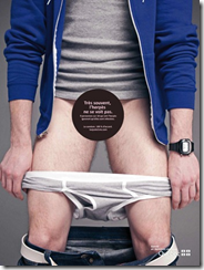 This week we launched the second phase of the Internet campaign that we call ‘Often, there is nothing to see’ for the Ministry of Health.
The development process of this phase was one of the most intricate that we have done here at the agency. Actually it’s probably the most complex projects of my career! As far as I know, you can count on a single hand the number of times that this type of ad format has been executed in Canada.
This took over 50 hours of work by our media team, without counting all the hours of development and programming done by our technological partners ALT Productions and EyeBlaster.
“Eyeblaster was thrilled to collaborate with Espresso Media on its highly innovative awareness campaign to prevent STDs. The integration of live site content into the ad panel maximized the feeling of the page ‘falling down.’ This original effect was created using a custom script developed by Eyeblaster specifically for this campaign to stretch the panel to 100% of the page. The campaign, setting new standards for innovation and creativity in Canada, is particularly noteworthy due to the campaign’s visual impact that really can’t be missed. “
– Claudio Lombardo| Sr. Creative Account Manager, Eyeblaster
The execution was so elaborate for the team that at one point we even questioned the feasibility of the entire project. On several occasions we thought that our ideas were too ambitious, and that we would be better off finding a plan B.
It is with a huge sigh of relief that we proudly share the details of this new execution that will, without a doubt, surprise more than one! (See the demonstration video at the end of this post).
EXECUTION DETAILS
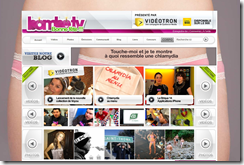 In order to attract the target’s attention, we opted for a wallpaper format, with a rather surprising creative, across several popular sites reaching the youth target.
With the agreement of the editorial teams, we replaced the usual backgrounds of each site with a picture of a young man/women wearing nothing but underwear.
Once we had grabbed the attention, it was hard to not be 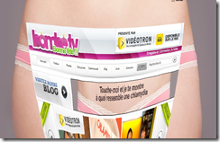 intrigued by the banner where the message was “Touch me and I will show you what a Chlamydia looks like”.
Once the banner was clicked, the entire site folded towards the bottom. The underwear of the young man/woman was also pulled down in synchronism with the content of the site. This made room for the message ‘Quite often, you can’t see Chlamydia. Condoms, 100% alright. Tasjuste1vie.com”
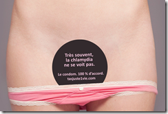 In order to make this execution believable, we had to reproduce an updated photocopy of the homepage (content and layout) and overlay it on the wallpaper background. We personalized this for each site, each homepage.
You can find this animation on several sites visited by the youth target such as: Bombe.tv, Ckoi.com, Hhqc.com, Hollywoodpq.com, et Musiqueplus.com.
DETAILS ON THE TARGET AND STRATEGY
For those who did not read the last post, Espresso Media handled the online portion of this campaign. To reach this highly coveted target (15-24 year olds), we needed to be creative in order to surprise them and captivate their attention.
We strongly believed that a standard ad banner would not efficiently reach the heart and interests of the target. Actually, we think that one is very disconnected from today’s reality if they believe that a simple big box campaign on sites such as musiqueplus.com is efficient to reach the target.
In order to entertain the target, we planned a campaign that we are proud to be associated to. The campaign that was based on:
– Innovation in the choice of ad formats, bet on the ‘newness’ factor
– Creation of a new and impactful ad format, little or not yet exploited so far
– Investment in interactive and engaging ad pieces
– Favour video utilization
